Two poster redesigns based off the iconic movie Halloween and its iconic poster
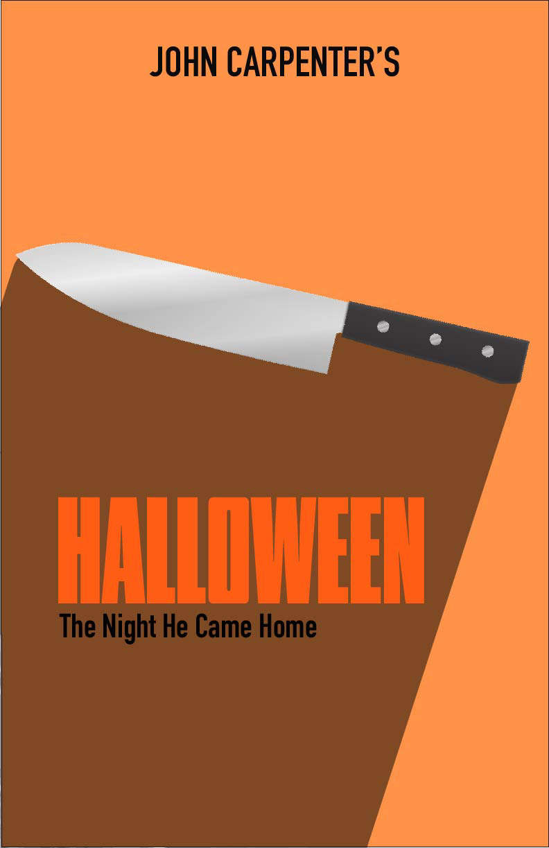
I designed this for a class project. We had to choose from a select few graphic design styles. I chose minimalism. My idea behind this design was to get the iconic orange from the holiday of Halloween. I also wanted to incorporate the knife that is so widely known from the movie. The text is a bold type that embodies the bold theme of the movie. It also contains the main slogan on the main poster.
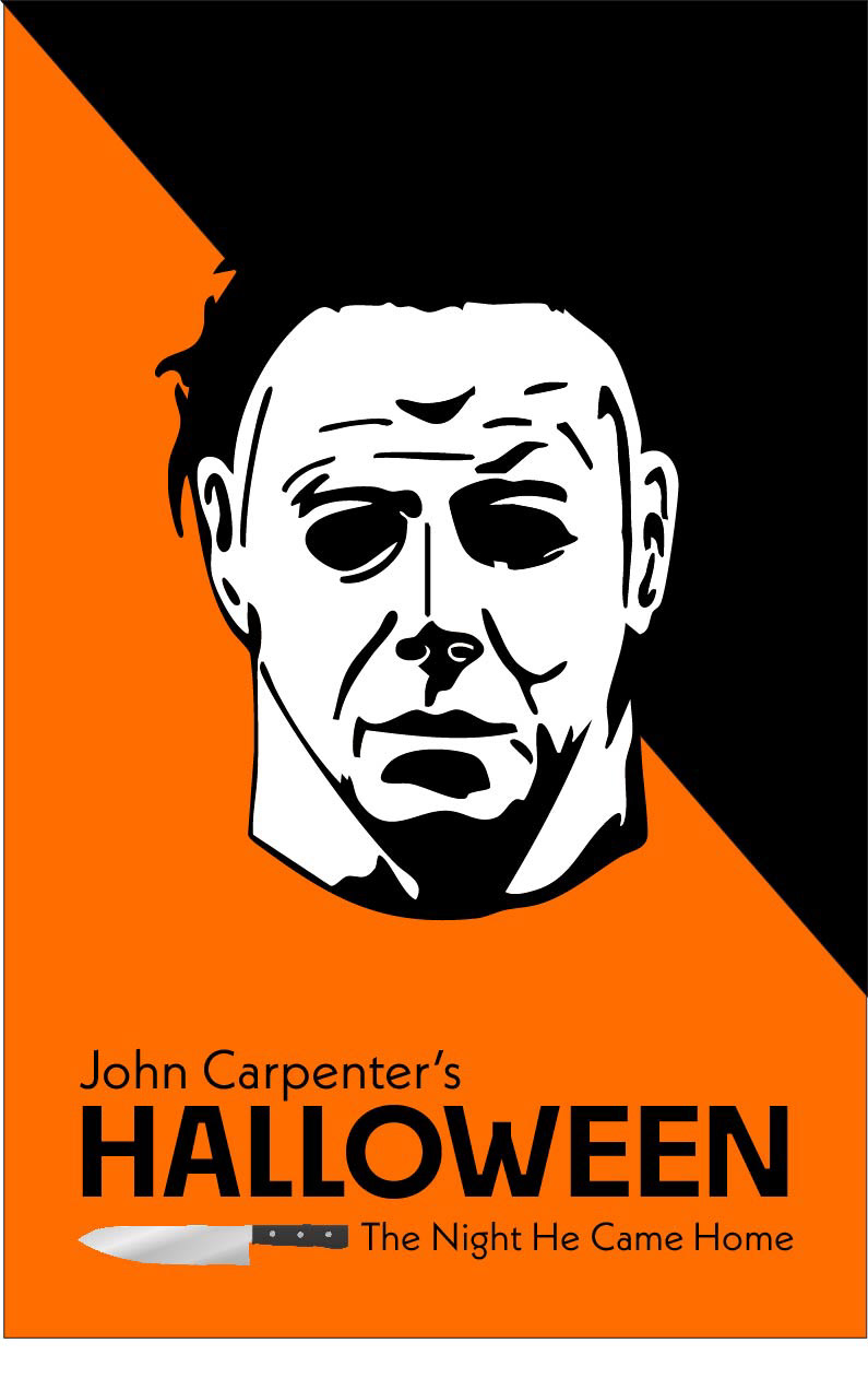
This was also designed for the same project, using the same theme. The idea behind this one was to put the iconic mask as the focus point. Keeping that same bold font, but adding the knife as a kind of underline. With the slogan that is on the original poster.